
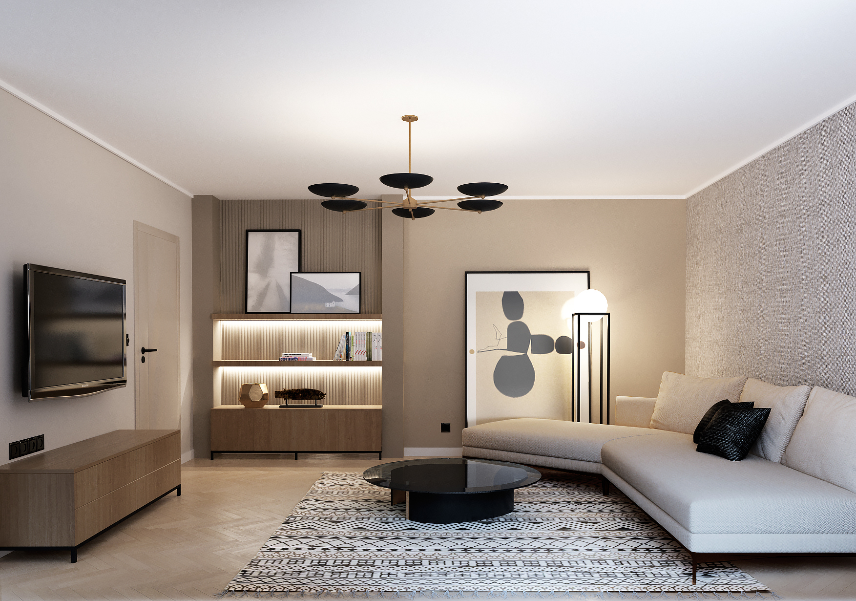
An interior built on the principle of a neutral nuanced frame by means of gradation and dosage, enriched with textures and controlled contrasting elements. Actually, it all started with the idea to create a solution in black and white. This turned out to be a difficult task for me – harsh graphic contrast is far from the habitat we usually create for humans. It was through this interior I was able to clearly see my own approach to work.
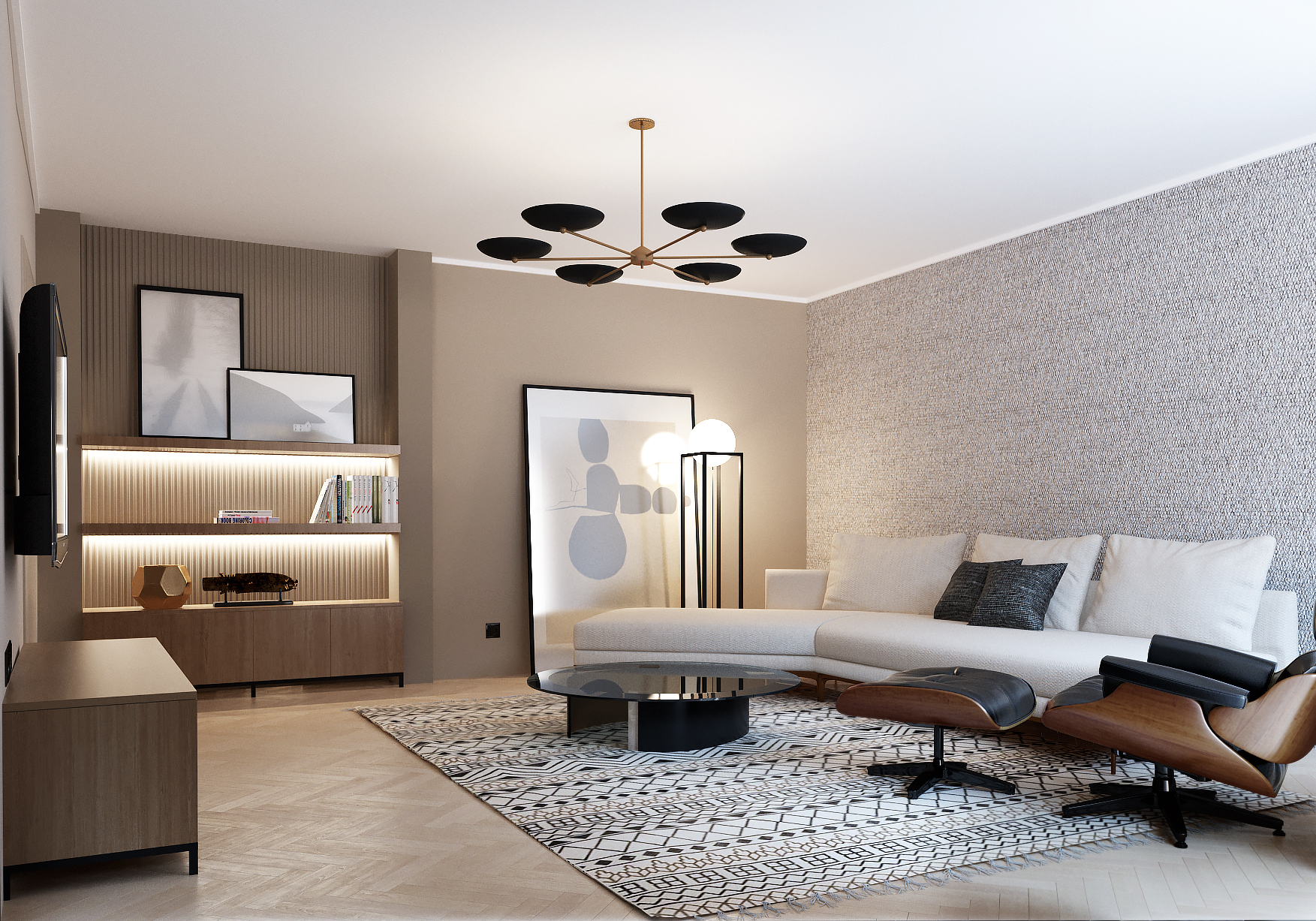
The project is an example of how I build premises – by creating a nuanced base which is relatively neutral and blends elements smoothly. In this very frame I have the option to expose contrasting accents. This approach allows us to gradate and through this gradation to create softness, as well as that feeling of cosiness people are looking for.
Nuancing of this calm frame is the key – playing is not only with two colours, but also with textures greatly enriching the solution, telling different visual stories. In the living room there is a tapestry with a textile texture on the wall behind the couch, fishbone parquet, and vertical stripes behind the wardrobe. Each of these elements brings an association for different tactile feeling, but at the same time they are all united in a common quiet range.
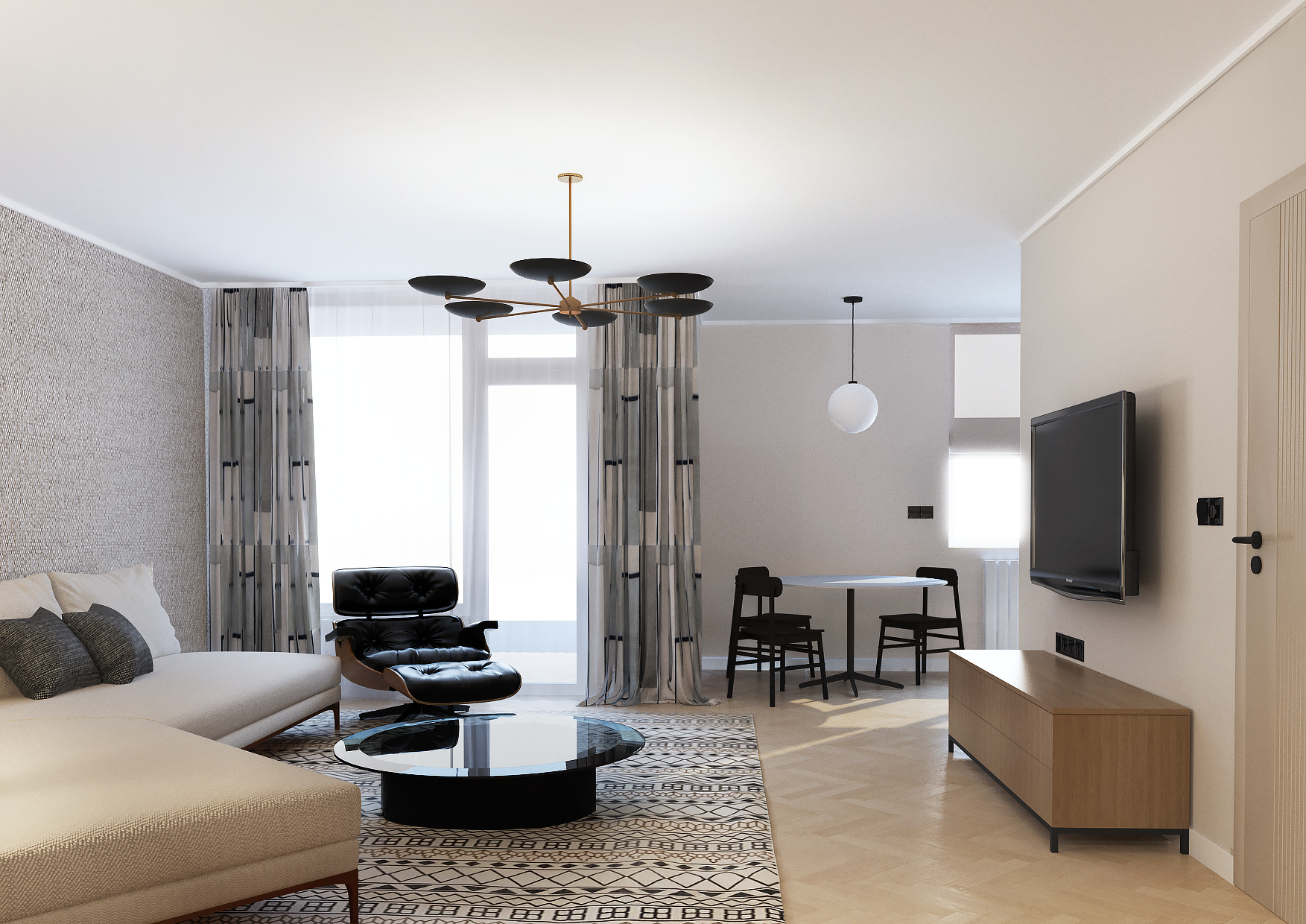
In this relaxed context, we simply apply and contrast in a controlled manner strong elements such as an almost white textile sofa, a pure black glass table, and a black leather armchair which is also a designer emblem of Charles Eames for VITRA. It is in the armchair that a material such as wood appears, which we transfer horizontally to the cabinets. In the dining area the stylistic changes itself to something more minimalist and almost Scandinavian. The idea of this switch from more “talkative” and compacted design to more restrained statement appears to be both a relaxation for the senses and dosing of the visual plot. It is as if the transition is drawn – starting from the floor by means of the intensity of the Moroccan carpet of BERBER type and passing through the pattern of the dense curtain which seems to calm the carpet’s screen, preparing us for the refined styling of the dining room.

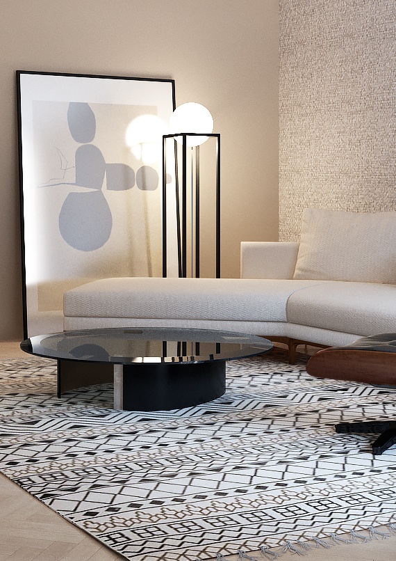
In this collection of seemingly incomprehensible elements, the most
dramatic is the role of the chandelier – in its typical English style,
it not only reveals itself in contrast, but also strongly influences the
style of the space with its reference to the classics of the beginning
of the last century. Lighting is an important and fun topic, because it makes a link between both the different zones and contrasting colours/shapes. Minimalistic lighting fixtures such as white balls are opposed to the black chandelier. The standing lamp is made especially for the project. A white ball is inscribed in a geometric metal frame – a solution connecting the two premises: the living room and the dining room, together with the black and white, the round and geometric.
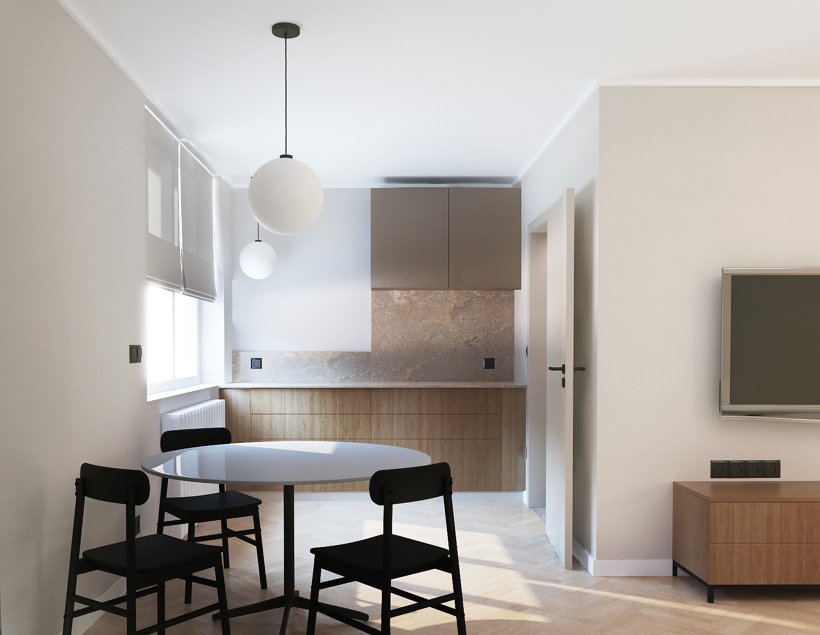
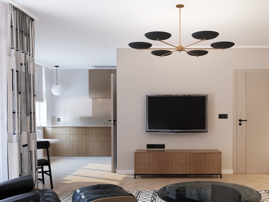
Behind the wall with the TV the kitchen box is situated, accessible from two sides – from the side of the corridor and from the side of the dining room. Since its area is small and in order for the volume of the living room not to be reduced, the auxiliary cabinets “flow” towards the dining room, repeating the materials of the living room with veneer in the lower row, combined with an unconventional stone of marble type.